Blog
Painting of the Week – Guardian Angel

Color Contrast
This painting is another from a visually inspiring trip to Spain in 2000. Since terracotta roofs and tile line the streets, most of my paintings from there have a warm (like the sun) palette. “Guardian Angel” is the only cool dominant (like the sea) painting from that series. The title is based on a little surprise I had… In the effort to separate the white buildings where they met, I created an irregular contrasting shape. It appeared as an angelic Violet figure, a brush stopping experience. The mother with stroller reminded me how Paul’s folks told us they would watch the kids that day.
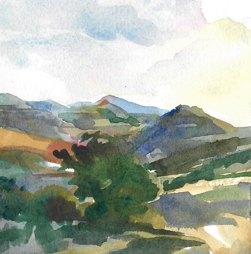
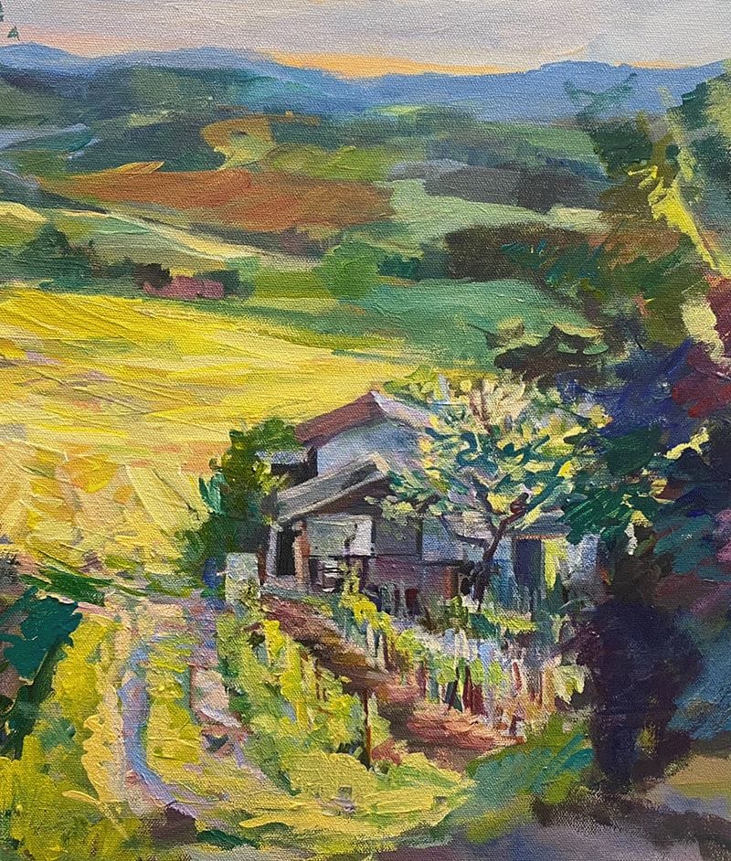
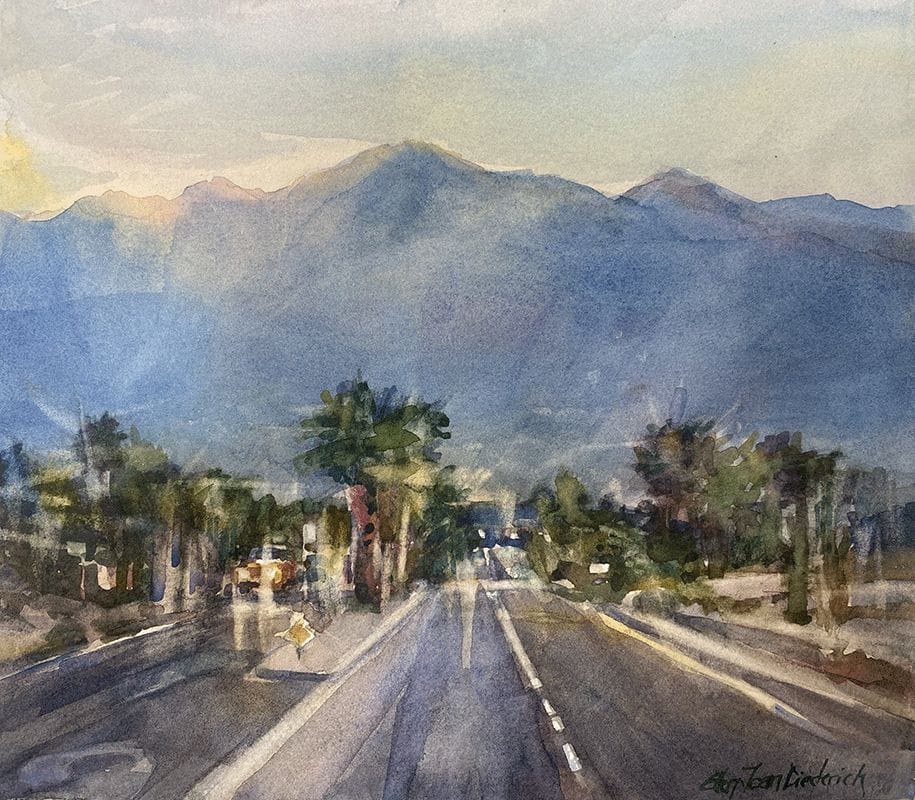
My “Building Your Center of Interest” workshop began yesterday. We practiced a variety of ways to contrast and connect the subject to the background in black and white. Then we studied using contrast with color and how to do that effectively and attractively. This class will be available as a video in the near future.
Sincerely,

CHECK OUT MY FACEBOOK | PINTEREST | TWITTER | LINKEDIN | BLOG
______________________
My Gallery
Have you clicked on “Gallery” on my website before? It breaks into four areas: Originals, Reproductions, Cards & Books. Use the right arrow to peruse the area of interest. If you touch on one, it brings you in the detail area and it will make you start over. Instead, slide downwards and it will continuously show the whole collection!
______________________