Blog
The Power of Colorful Darks

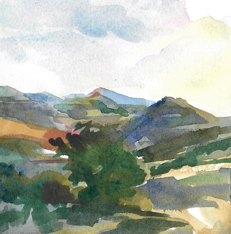
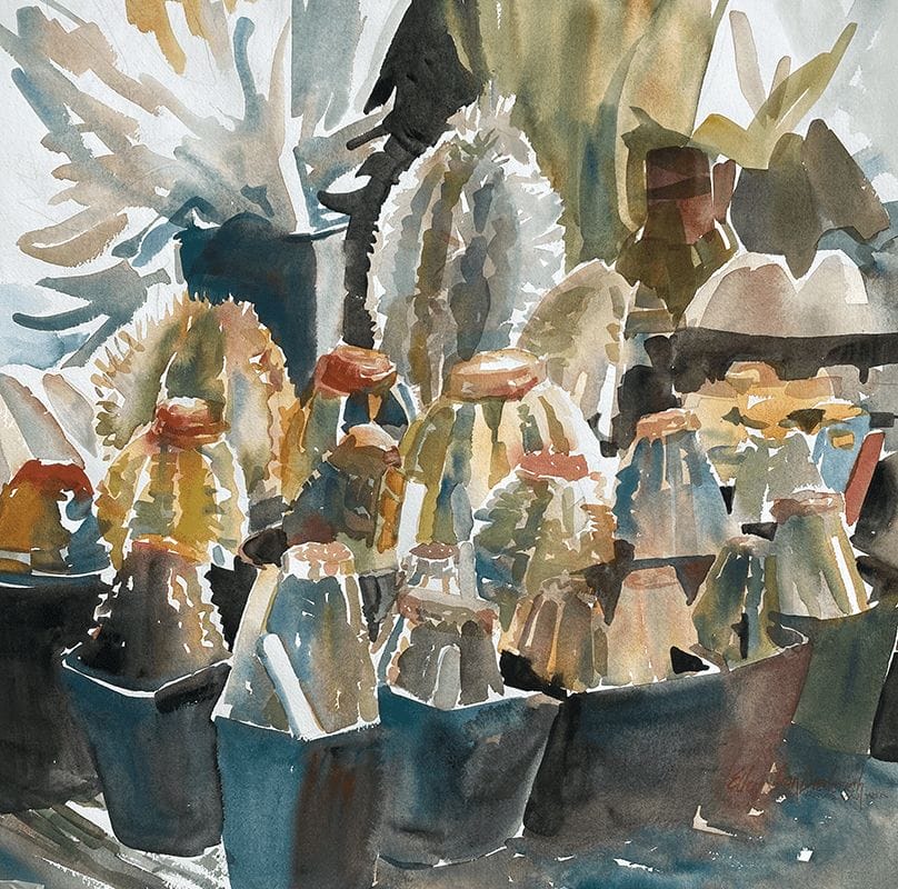
I occasionally change a painting after I see it framed. That happened with my painting
Sunbelt. I wanted to share with you this change as it showed that adding colorful dark values tremendously increased the depth of this painting. I have an upcoming workshop called:

Revised
Using Colorful Darks to Create Powerful Paintings
With Instructor Ellen Jean Diederich TWSA, RRWS, WSA
April 4-6
Fargo Holiday Inn

Original
(701) 235-4241
Class is from 9:00 am to 3:30 pm with a one hour lunch break
Workshop price $195.00. A $75 deposit will guarantee your spot.
Contact Ellen for more information
The original color theory was changed to make my painting Sunbelt work. Previously the painting (lower image) is close to being monochromatic, as the yellow dominates and overpowers the painting. It is truly a very warm painting with analogous colors orange, yellow, and green. I felt it was too warm and that bothered me enough to change it. The most logical way to combat warmth is to use cool colors. Instead of using the compliment of yellow, which is violet, I used a near compliment, blue violet, to work through the painting. This immediately gave relief to this problem.
What helped me was to think back to my original idea for the painting. My interest was the shelter belt of trees next to the sunflowers. The plain field shape really separated the sunflowers from the trees and didn’t seem to add anything. After pondering these issues I used a technique reminiscent to pointillism to create the perspective of the rows of sunflowers, bringing the field up next to the trees. I carried the directional lines of the rows forward through the Sunflowers. I love it now.