Blog
Color Wheel Painting Tips.

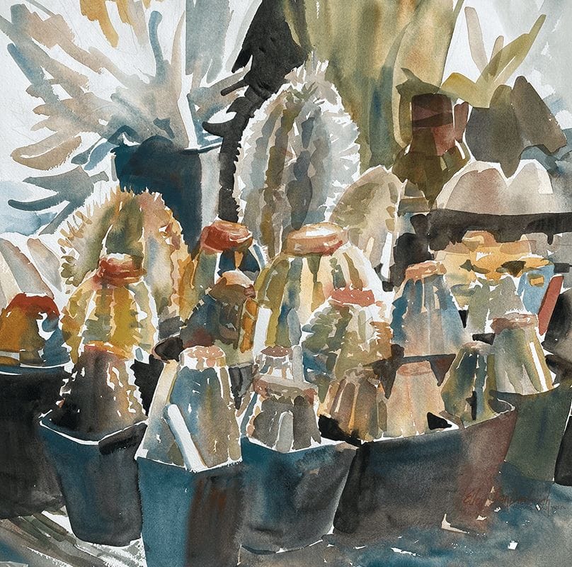
Garden Veranda is a very simple watercolor that exploits value in color.
I know you are probably thinking, simple? Yes! As long as you understand the basics to color, you can paint beautiful works of art.
I will show you exactly how you can achieve great colors in your paintings!
In Garden Veranda, you can see that the building is yellow.
Obvious right?
BUT it is the variations in the color that make it work. To start with I painted it in a light yellow and then the shadows were added in darker values and harmonies of yellow.
Harmonies are colors on the color wheel next to each other.
Here is a snippet from my book Progressive Painting that explains more on colors.
As you can see, yellow is next to orange and green on the color wheel. Look closely at the painting and you will see how the shadow changes to darker yellows, yellow-orange, yellow-green and is then complemented with violet to tone it down.
I chose violet as the primary complementary color for the trunks and vines and again varied the in color.
Complements are colors across the wheel from each other. Complements can be painted next to each other to create a pop, or mixed to tone another down.
A quick breakdown of details in the painting and their color relations:
- Violet is next to red violet and blue violet. The leaves in green and blue flow together and contrast the warmth of the building. (If you look carefully at the vines, they also change slightly in thickness and color so they are not a stagnate line.)
- The pots in the left corner of the foreground are very toned down as to not draw too much attention.
If you are a visual learner, I found this video explaining in more detail complementary colors. Which you can check out below!
Ellen


